Fillers: Day 3
[7/23/2011 EDIT: There's no filler here anymore. Move on. Besides, I'm pretty sure you came to this thread to read comics. Those are below.]
More endeavors in comedy.
-
Fairlight Excalibur
- Member

- Posts: 879
- Joined: Sat Nov 28, 2009 6:20 am
- Location: LA

-
Deepfake

- Member

- Posts: 41808
- Joined: Sun Aug 18, 2002 1:00 am
- Location: Enough. My tilde has tired and shall take its leave of you.
- Has thanked: 107 times
- Been thanked: 47 times
- Contact:
Coloring discussion, etc.
Your cousin's colors might not be accurate, but they're very nice. Softer colors and lines makes it a bit easier on the eyes, and the yellow for the hair is a bit richer. Philanthropy's palette is really slick, the other two don't have that nice combination with the colors. If you want some tips about how to work your colors in private, I'll be happy to talk about my own ideas on technique and how they might apply. As far as your cuz's colors go, I dig them well enough except for the flat greys and the brown leaning a little too far toward green. A richer, reddish tone would've been nice.
As a rule about the grey in print, it's usually better to use a faded color tone. Grey in commercial print is accomplished through fine dithering, and the finer it gets the more expensive it gets, and you never get that nice solid look that the colors will have. Using subtle colors will also give you a wider range of highlights, as well. Just like IRL, everything reflects ambient light, so it's rare that you ever see greytones as a perfectly balanced neutral.
Of course, it's not like you're not allowed to like your lines, bro. Good luck getting anyone to consider publishing it, though. If you'd practice giving it some polish, you might get the experience necessary to really see what kind of sketchiness you can get away with.
If you want to get the door open to the publishing industry, I'd suggest starting a more traditional piece with that slick polished look everyone expects, and trying to get your foot in the door. You can certainly hold onto your pet project and get it published later on, which is all the more appealing if you've got your history of concepts to re-work. If you'd rather keep it sketchy and loose, I'd suggest avoiding the whole publishing market altogether, though. Start a webcomic series, and if you make some money elsewhere, in advertising, or through mechandise you can use that to do limited runs of your stuff in print. No publisher necessary. :3
Oh, and try to plan ahead if you want to color a piece. It looks a bit awkward if you're doing line shading and need to color it afterwards (although it's easier if you're willing to use composite layers). I found that out the hard way, that I would want to touch up shading with the comp afterwards and naturally the kind of shading you do with the comp isn't the kind you do with a pencil.
I muttered 'light as a board, stiff as a feather' for 2 days straight and now I've ascended, ;aughing at olympus and zeus is crying
-
Antisocial

- Member
- Posts: 14310
- Joined: Wed May 10, 2000 1:00 am
- Been thanked: 17 times
CRINKLE
^^ Thanks muchly for the advice. Hopefully it'll be of help in the Photoshop class I'm currently taking. Next time I do a colored piece, maybe I'll see if I can drop you a line and glean from your techniques.
^
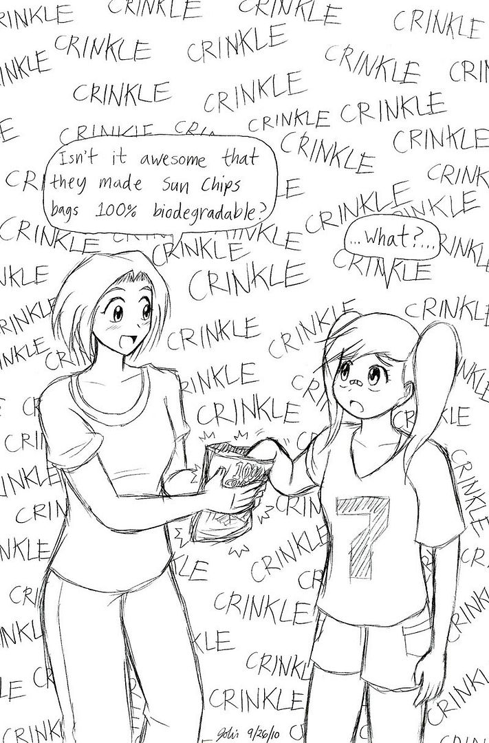
Crinkle possessor: Yin Chizumi
Crinkle inducer: Keiguru Nakahoro
^^ Thanks muchly for the advice. Hopefully it'll be of help in the Photoshop class I'm currently taking. Next time I do a colored piece, maybe I'll see if I can drop you a line and glean from your techniques.
^
WE NOW RETURN YOU TO YOUR REGULARLY SCHEDULED COMIC STRIPS.Several pages ago:
Yeah. I know you're all sitting back incredulously, thinking "...Really?", assuming it was a lame attempt at finding a counterpart to Luigi. It was. I made it up. Imagine my surprise when I found out later that it actually exists as a name.
Crinkle possessor: Yin Chizumi
Crinkle inducer: Keiguru Nakahoro


-
Antisocial
- Member
- Posts: 14310
- Joined: Wed May 10, 2000 1:00 am
- Been thanked: 17 times
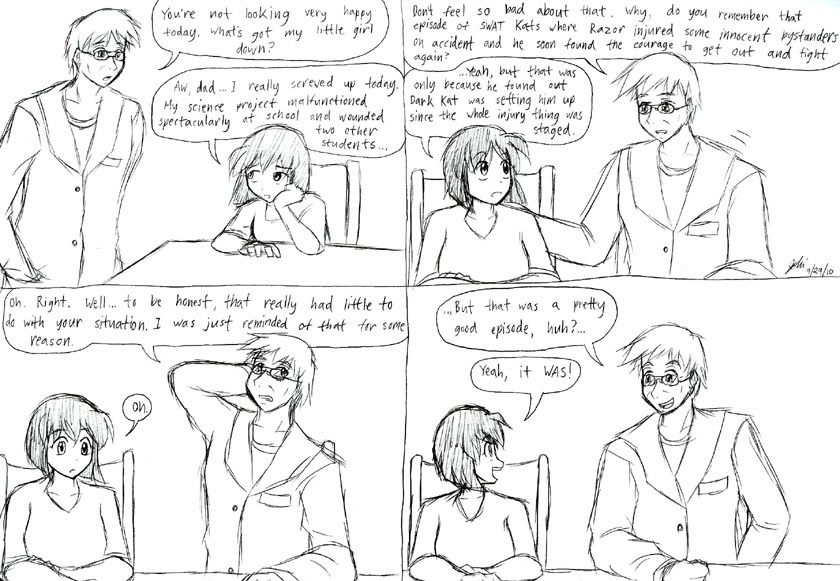
I doubt there was such an episode in real life.
^ Thanks. I've pretty much posted all my good colored pieces on VGF already, so you're gonna have to wait.
HotD's still not back from her vacation yet, so here's another old comic.
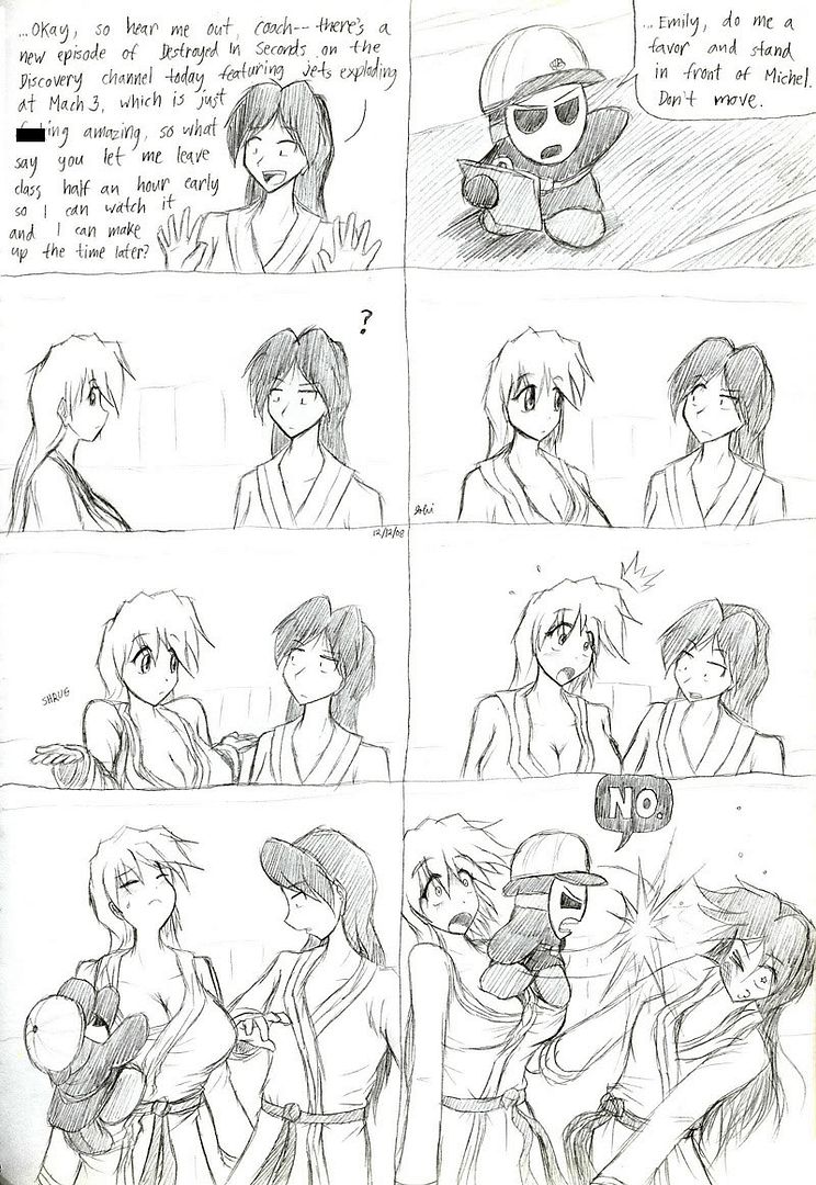
Destruction girl: Michel Lapland
Platform girl: Emily Yurimitsu
Climbing guy: Misanthropy
^ Thanks. I've pretty much posted all my good colored pieces on VGF already, so you're gonna have to wait.
HotD's still not back from her vacation yet, so here's another old comic.
Destruction girl: Michel Lapland
Platform girl: Emily Yurimitsu
Climbing guy: Misanthropy
-
Antisocial
- Member
- Posts: 14310
- Joined: Wed May 10, 2000 1:00 am
- Been thanked: 17 times
-
CaptHayfever

- Supermod
- Posts: 40615
- Joined: Tue Jul 16, 2002 1:00 am
- Location: (n) - the place where I am
- Has thanked: 1220 times
- Been thanked: 803 times
- Contact:
-
Antisocial
- Member
- Posts: 14310
- Joined: Wed May 10, 2000 1:00 am
- Been thanked: 17 times
-
United Nations

- Member
- Posts: 13210
- Joined: Thu Jun 29, 2006 3:54 pm
- Location: If you see a stranger, follow him.
- Has thanked: 62 times
- Been thanked: 34 times
-
CaptHayfever
- Supermod
- Posts: 40615
- Joined: Tue Jul 16, 2002 1:00 am
- Location: (n) - the place where I am
- Has thanked: 1220 times
- Been thanked: 803 times
- Contact:
-
Antisocial
- Member
- Posts: 14310
- Joined: Wed May 10, 2000 1:00 am
- Been thanked: 17 times

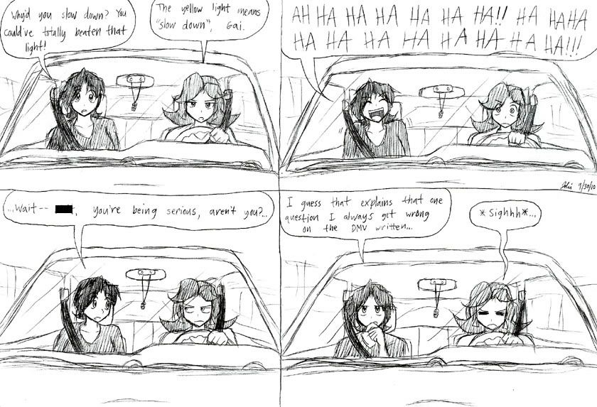
Not here - the meaning is "slow down and stop unless it is not safe to do so"CaptHayfever wrote:It actually just means "Caution". If you're sufficiently close to the light, you're supposed to maintain speed & go through it rather than cause an accident by stopping too abruptly.
And remember, "I'm-a Luigi, number one!"
Why is it drug addicts and computer afficionados are both called users?
-Clifford Stoll
-Clifford Stoll
-
Fairlight Excalibur
- Member
- Posts: 879
- Joined: Sat Nov 28, 2009 6:20 am
- Location: LA
-
Rainbow Dash

- Member
- Posts: 25503
- Joined: Sat Jan 20, 2001 2:00 am
- Contact:
-
Antisocial
- Member
- Posts: 14310
- Joined: Wed May 10, 2000 1:00 am
- Been thanked: 17 times
-
Greenmarioman

- Member
- Posts: 18106
- Joined: Sat Jul 01, 2006 8:16 pm
- Location: the leather club two blocks down
- Has thanked: 3 times
- Been thanked: 2 times
- Contact: